Bitcandy Studio — Digital Experience & UX Design Agency | India & USA


Strengthening the Brand identity and web UX/UI of a lifestyle community
industry
Co-living & Property Technology
Services Provided
Architecting the future of urban living through strategy-led design and digital-first branding.
Dot Coliv is a UAE-based co-living and property technology brand built for modern professionals, students, and urban migrants seeking clean, safe, and affordable living spaces. More than just shared accommodation, Dot Coliv aims to create structured, community-first environments where convenience and credibility coexist.
However, while the infrastructure was strong, the brand expression did not reflect the lifestyle-forward experience Dot Coliv was offering. The opportunity was clear: transform a functional housing brand into a cohesive lifestyle identity.
Bitcandy Studio was commissioned to lead a comprehensive brand transformation—revamping the brand book, redefining the visual identity system, and repositioning Dot Coliv as a modern Lifestyle Community brand rather than a transactional rental provider.
The Challenge
Escaping the “Generic Rental” Identity
The co-living market, particularly in competitive urban hubs like the UAE, often feels indistinguishable. Most brands rely on stock imagery, templated visuals, and price-led communication. The result? A lack of emotional connection and long-term brand recall.
Dot Coliv was facing this exact challenge. While their operational model emphasized safety, hygiene, verified listings, and structured living, their brand presence felt overly functional—closer to classified listings than a lifestyle ecosystem.
The challenge for Bitcandy was to clarify and elevate the brand identity. We needed to build a system that conveyed trust and professionalism while also reflecting warmth, community, and modern urban living. Dot Coliv wasn’t just providing bed spaces, it was offering structured belonging.
The brand needed to reflect that intention, and also appeal to a young demographic.
The Strategy
Repositioning Co‑Living as Lifestyle
Before moving into logo development and visual execution, we began with a strategic immersion phase. We examined Dot Coliv’s positioning within the broader co-living and property technology landscape.
Our key insight: the product was not just real estate. The real offering was community. So we repositioned Dot Coliv as a lifestyle community brand built around three pillars:
- Structure and safety
- Community and belonging
- Urban convenience
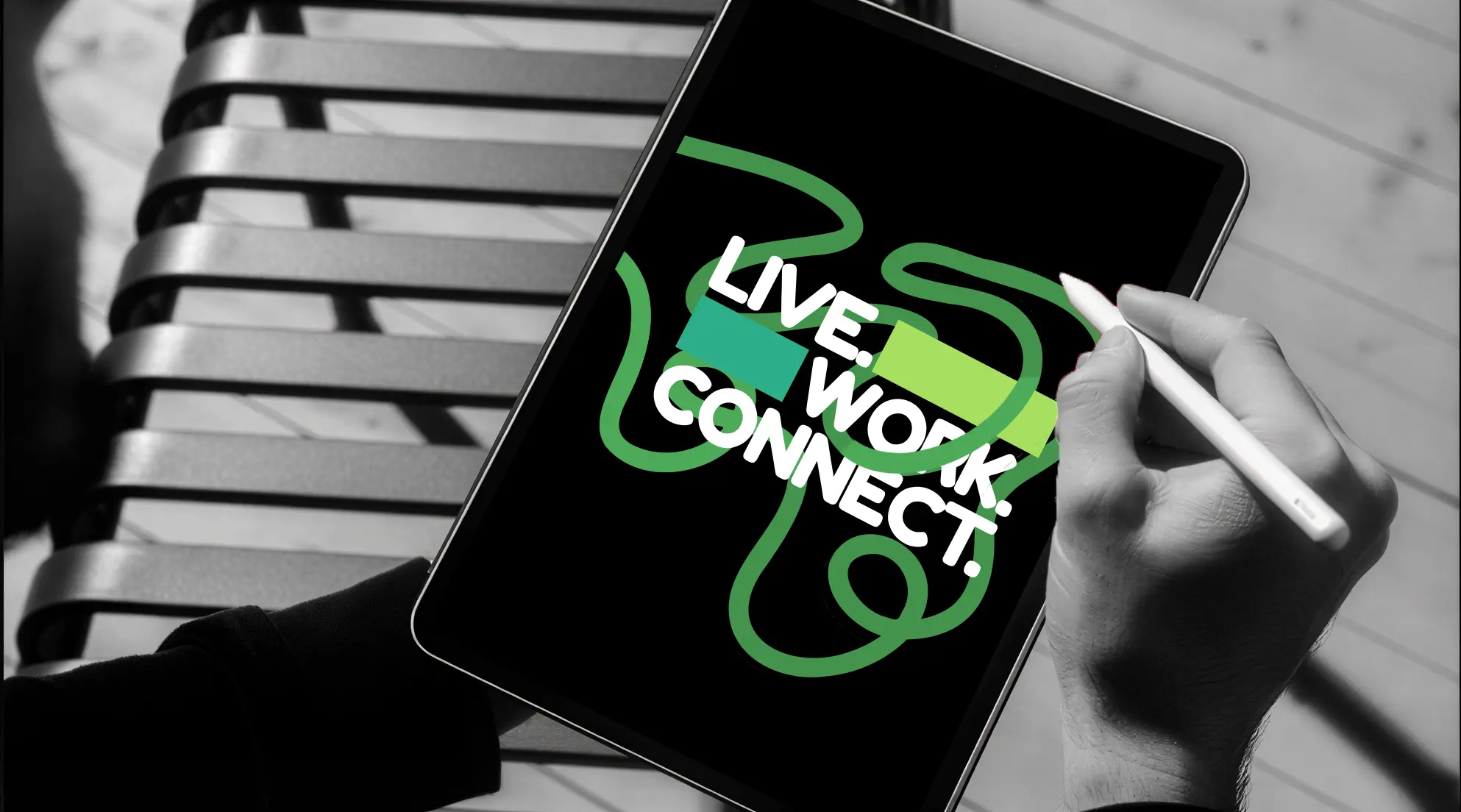
This repositioning informed the revamp of the Brand Book. Instead of focusing purely on amenities and pricing, the narrative shifted toward experience, tone of voice, and brand behavior. The slogan was given visual importance, becoming an integrated part of the brand language rather than a standalone line.
The strategy centered on making Dot Coliv feel modern, digitally native and community centric.
The Execution
Building a Structured Yet Human Identity
With the strategic foundation in place, we developed a comprehensive Brand Identity Design system.
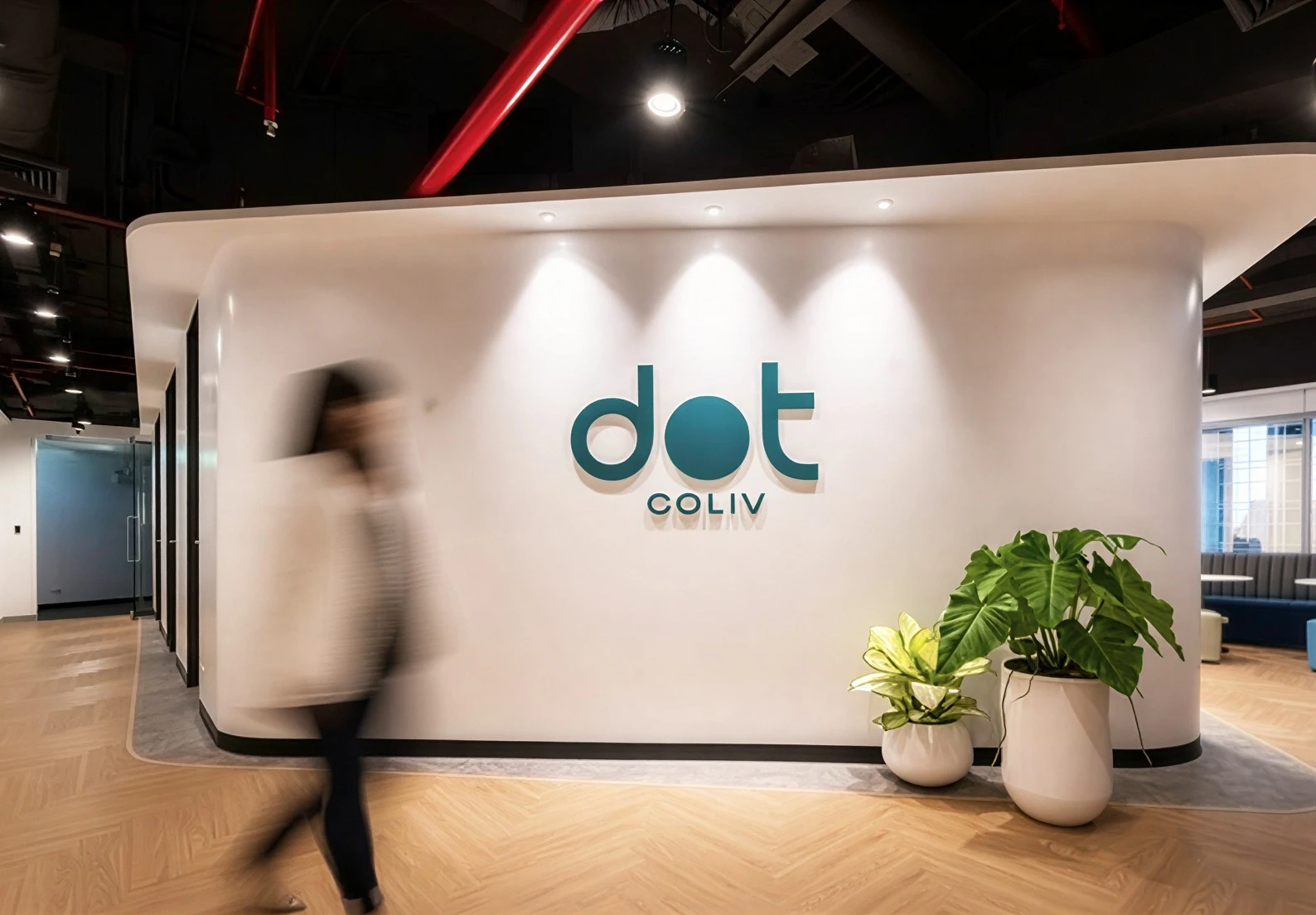
The Lifestyle Community Logo Design:
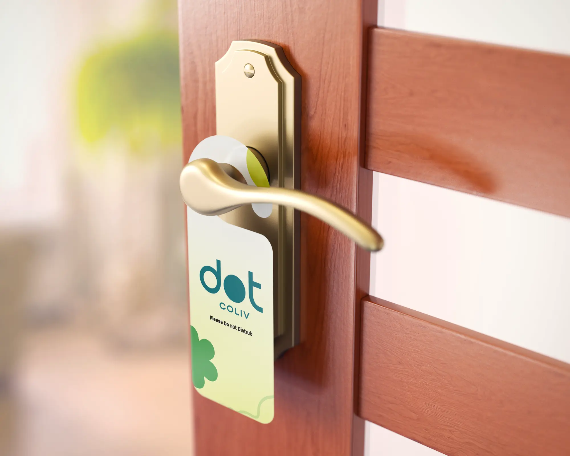
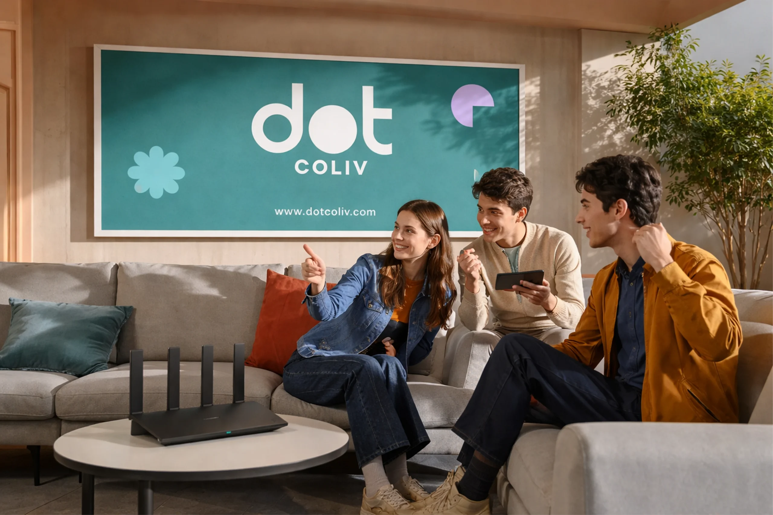
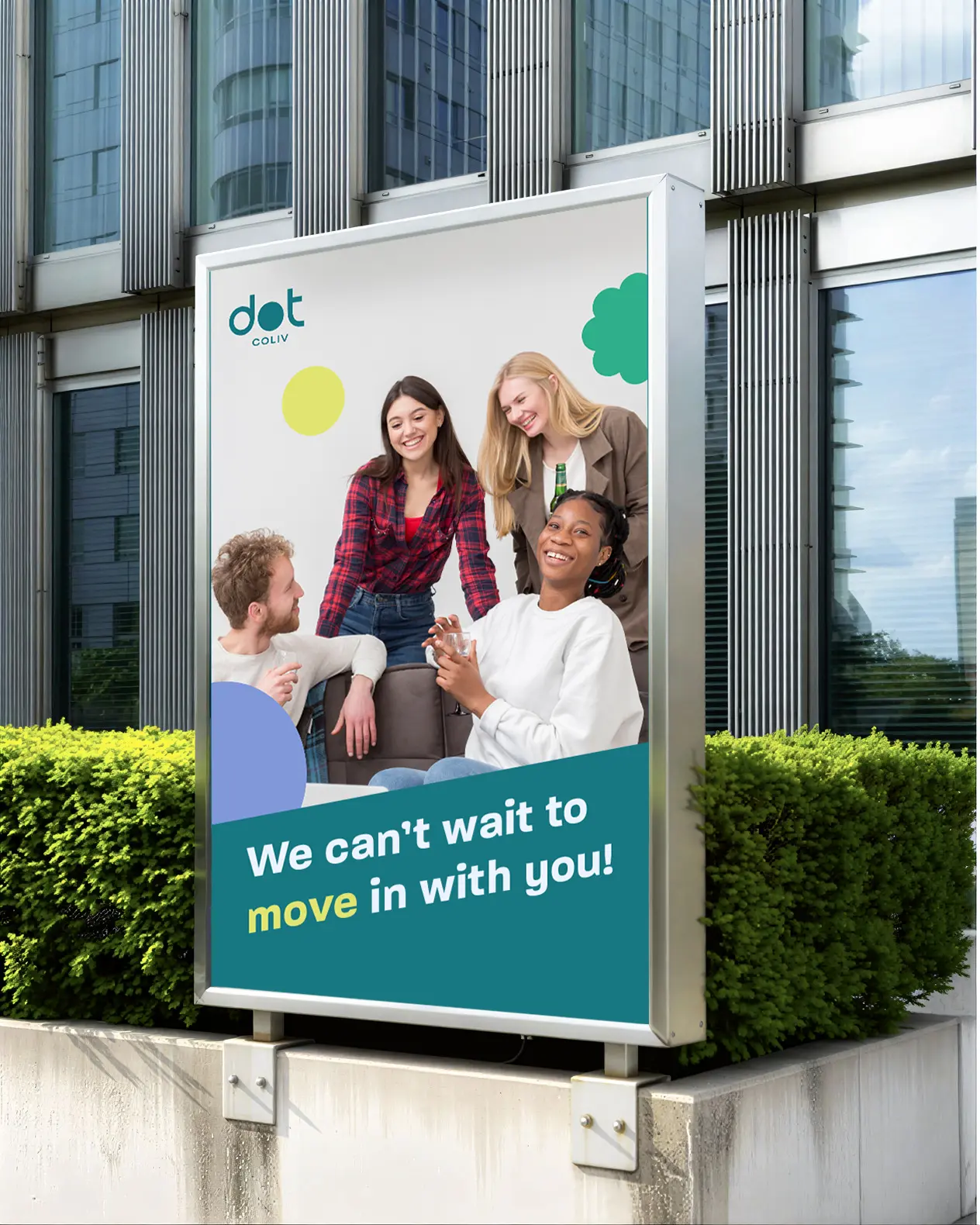
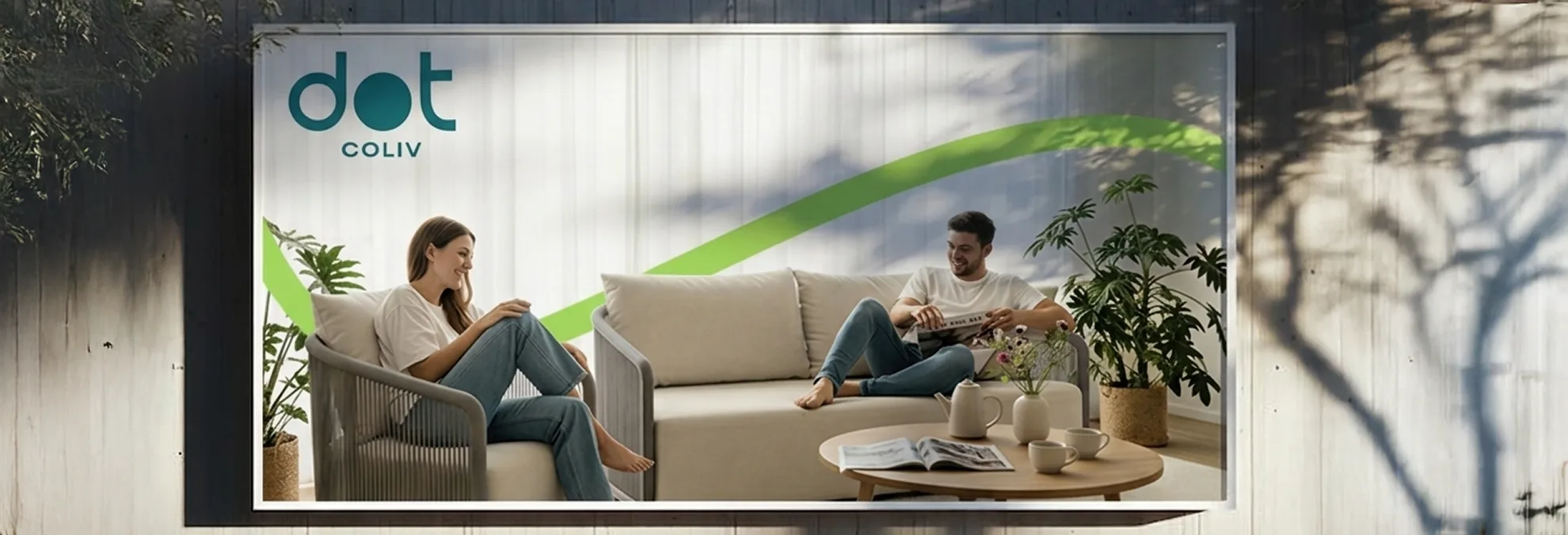
The new logo was designed to symbolize modular connection. Structured yet approachable, it visually represents individuals (“dots”) forming a unified community. The mark balances geometric stability with fluid interaction, reflecting both organization and belonging.
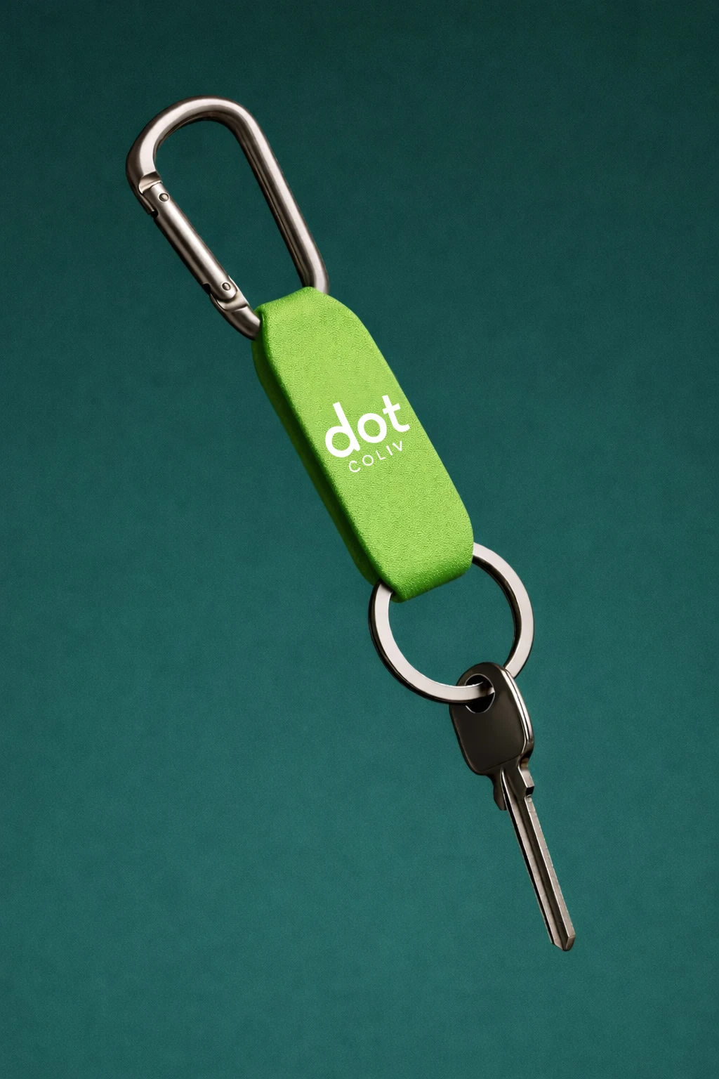
The logo suite was designed for scalability across digital platforms, property signage, documentation, and app interfaces.
Slogan & Visual Language:
Rather than treating the slogan as a secondary copy, we integrated it into the visual hierarchy. The typography, spacing, and layout were crafted to reinforce clarity and confidence. Messaging was made sharp, direct, and trustworthy.
Unique Illustrations & Brand Elements:
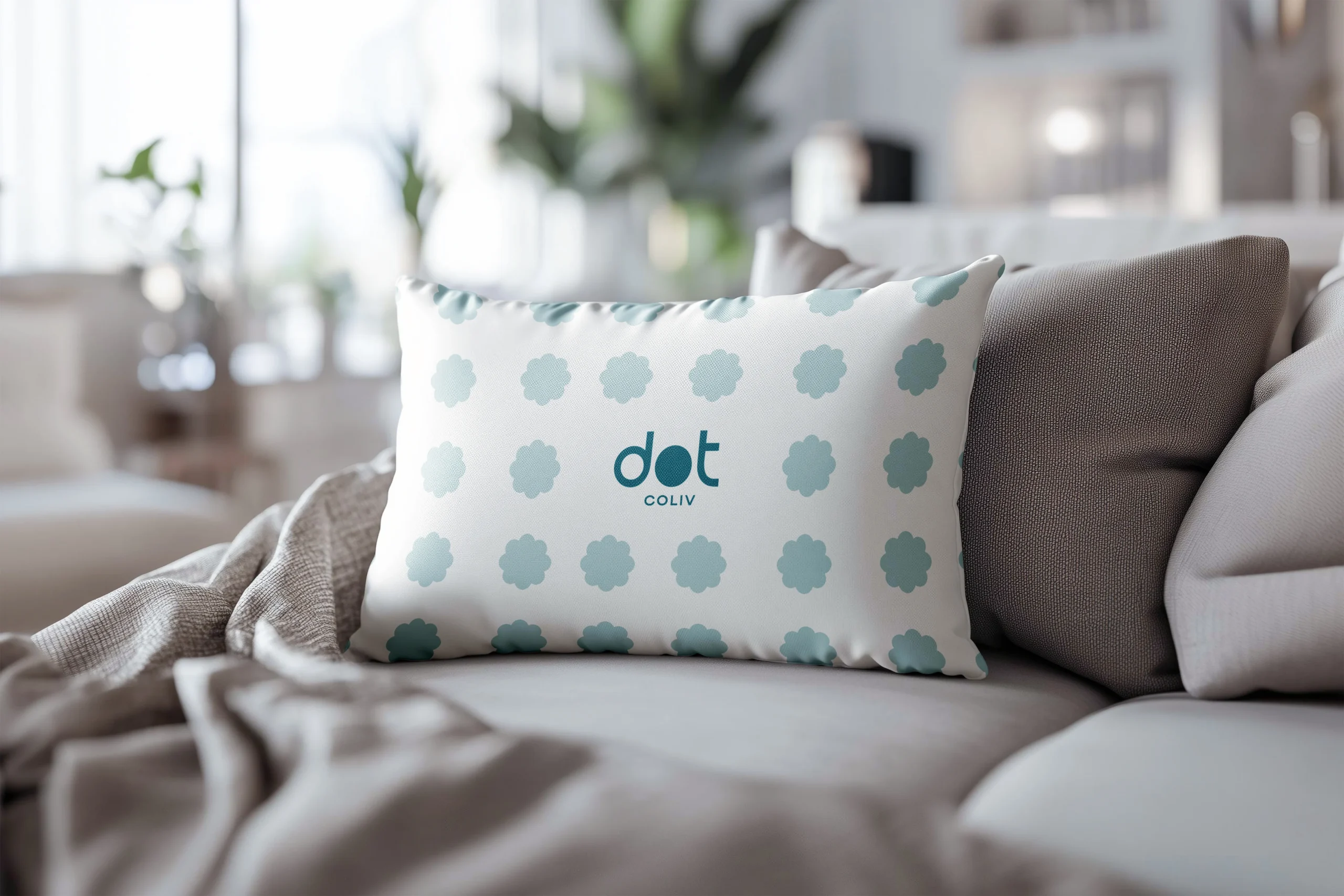
To differentiate Dot Coliv from stock-heavy real estate competitors, we developed custom brand elements and unique illustrations. These visuals introduce warmth and personality into an otherwise operational category.
The illustrations communicate community, urban flow, and shared experiences without relying on overused housing clichés.
The Revamped Brand Guidelines:
We rebuilt the Brand Guidelines to ensure clarity and consistency across all touchpoints. This included:
- Logo usage systems
- Color palette definitions
- Typography hierarchy
- Layout frameworks
- Illustration usage rules
- Tone of voice guidance
The palette was chosen to evoke safety and freshness, something that’s critical for a brand dealing with residential trust.
By the end of the project, Dot Coliv had undergone a meaningful transformation. The brand no longer resembled a transactional rental service. Instead, it now presents itself as a structured, digitally aligned, community-driven lifestyle brand. The cohesive branding system strengthened perceived credibility, rendering it an essential asset in the co-living market. The new identity positions Dot Coliv as modern, organized, and scalable, ready to grow within the UAE’s competitive housing ecosystem. More importantly, the brand now reflects what it truly offers: clarity in a chaotic rental market, community in a fast-moving city, and structure in shared living. Dot Coliv, since then, has never been just about rooms.